
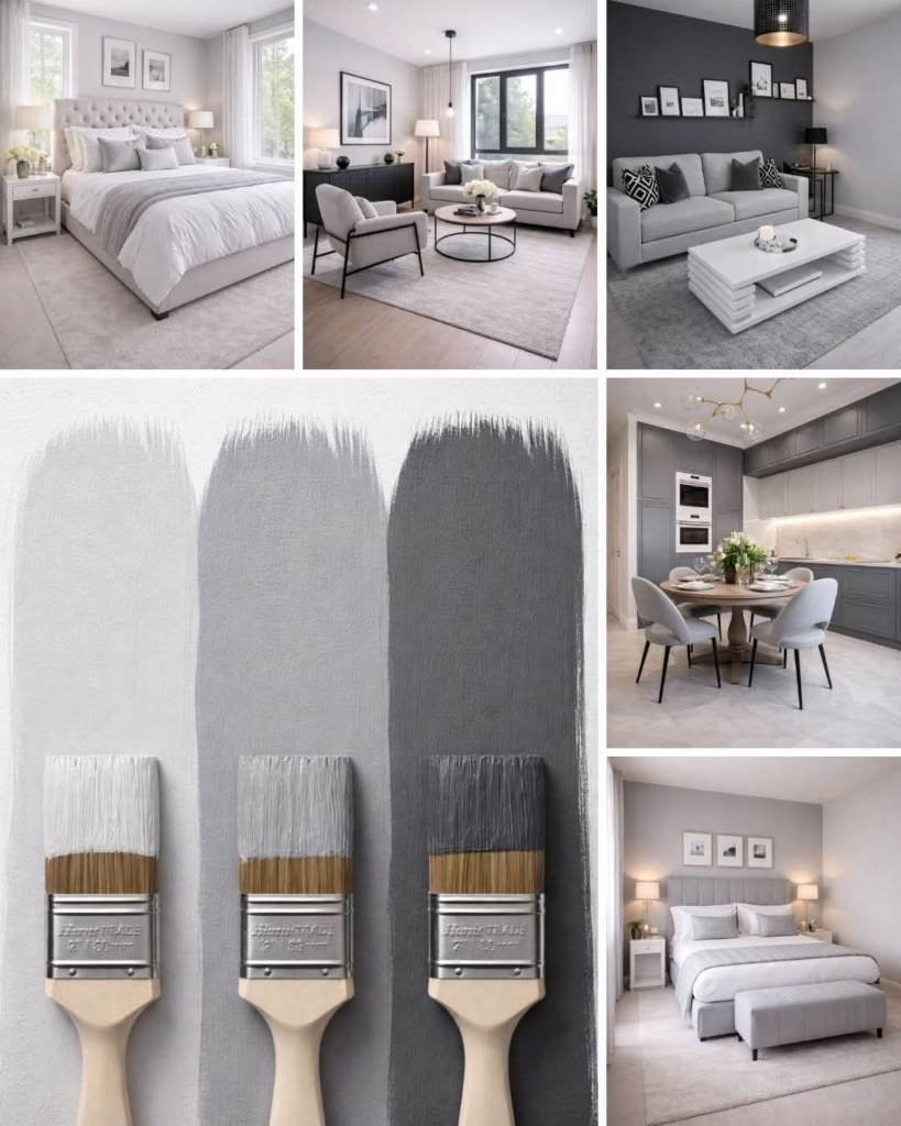
Choosing a color for a bedroom sounds straightforward until you’re actually standing in a paint aisle holding seventeen different swatches that all look almost identical. I’ve been there — overwhelmed, second-guessing everything, and eventually picking something safe that I wasn’t really excited about.
After a few bedroom updates over the years, I’ve learned that the right color combination genuinely changes how a room feels to be in. Not just how it looks in photos — how it actually feels on a tired evening when you walk in and want to decompress.
Here’s what I’ve learned about bedroom color combinations that actually work.
Why Bedroom Colors Matter More Than You Might Think
Your bedroom isn’t just another room in the house. It’s where you start and end every single day. The colors you surround yourself with while sleeping and waking up have a real effect on your mood, your stress levels, and even your sleep quality.
Warm, soft tones tend to create a relaxed and calm atmosphere. Cooler tones feel clean and serene. Neutral palettes feel timeless and versatile. Understanding this helps you make color decisions that you’ll still love two years from now — not just on the day you paint.
White and Beige — The Combination That Never Fails
There’s a reason this pairing appears in so many beautiful bedrooms. White and beige together create an atmosphere that’s bright, clean, and warm without being stark or cold.
Why it works so consistently:
- White reflects light and makes the space feel larger
- Beige adds warmth that stops white from feeling clinical
- Together they work with virtually any furniture style
- The combination feels sophisticated without being fussy
The key is adding texture to prevent it from feeling flat — wooden furniture, woven baskets, linen bedding, and chunky knit throws all work beautifully in a white-and-beige room.
Sage Green and White — Calm, Natural, and Very Current
Sage green has had a real moment in interior design over the past few years, and honestly it deserves it. It’s one of those rare colors that feels both fresh and timeless — modern without being trendy.
Paired with white, sage green creates a bedroom that feels like a quiet retreat. It brings in a natural, organic quality that’s genuinely calming.
It works particularly well with:
- Natural wood furniture and light oak tones
- White or cream bedding with subtle texture
- Rattan or woven accessories
- Warm brass or gold hardware
If you’ve been looking for a color that feels current but won’t look dated in five years, sage green is a strong choice.
Navy Blue and White — Bold, Clean, and Elegant
For those who want something with more visual impact, navy blue and white is a classic combination that looks striking without being overwhelming — as long as the navy is used thoughtfully.
The approach that works best: keep the walls and bedding mostly white, and use navy as an accent color through pillows, a throw blanket, curtains, or a feature wall. This gives you the drama of a deep color without the room feeling dark or heavy.
Navy pairs beautifully with warm wood tones and touches of gold or brass in hardware and lighting.
Dusty Pink and Grey — Soft, Modern, and Genuinely Relaxing
Dusty pink — a muted, grown-up rose rather than a bright pink — combined with soft grey creates a bedroom that feels quietly luxurious. It’s a combination that photographs beautifully but also genuinely feels calming to be in.
This works best when:
- The pink is soft and desaturated, not vibrant
- The grey leans warm rather than cold
- White is used as a third neutral to keep things feeling fresh
- Textures like velvet and linen are incorporated for warmth
It’s an unexpectedly versatile combination that suits both feminine and more neutral aesthetics depending on how it’s styled.
Warm Terracotta and Cream — Earthy and Inviting
Terracotta has made a significant comeback in interior design, and it works particularly well in bedrooms because of its inherent warmth. Paired with cream or off-white, it creates a space that feels grounded, cozy, and distinctly lived-in in the best sense.
This combination pairs beautifully with:
- Natural textures like jute rugs and woven baskets
- Dark wood furniture
- Warm lighting rather than cool white bulbs
- Burnt orange or rust accent pieces
If you want a bedroom that feels genuinely warm rather than just decorated, this palette delivers.
Charcoal and White — Dramatic but Sophisticated
For a bedroom that makes a real statement, charcoal grey with white creates a contrast that feels bold and refined at the same time. It’s the kind of color combination you see in high-end hotel rooms — clean, sharp, and quietly dramatic.
The important thing with this combination is balance. Too much charcoal and the room becomes oppressive. The best approach is to use charcoal on a feature wall or as an accent throughout, while keeping the rest of the space white or very light.
Warm lighting is particularly important in a charcoal bedroom — it softens the contrast and stops the space from feeling cold.
Lavender and Soft White — Serene and Timeless
Lavender is one of the most genuinely relaxing colors for a bedroom. It has a softness that encourages calm — which makes it a natural choice for a space dedicated to rest.
Soft lavender paired with white or very pale grey creates a bedroom that feels serene and elegant without being overly feminine. It works for children’s rooms, guest rooms, and adult bedrooms equally well.
Keep other elements simple when using lavender — let the color do the work and avoid adding too many competing patterns or strong accent colors.
Tips for Choosing Your Own Color Combination
A few things I’ve learned from trial and error:
Test before you commit. Paint a large swatch on the actual wall and look at it at different times of day — morning light and evening lamplight can make the same color look completely different.
Think about your furniture first. The colors you choose need to work with what you already have, not just with each other.
Stick to three colors maximum. A main color, a secondary color, and a neutral. More than that usually creates visual confusion.
Consider the light in your room. North-facing rooms need warmer colors to compensate for cool light. South-facing rooms can handle cooler tones because they get more natural warmth.
Frequently Asked Questions
What bedroom colors are best for sleep?
Soft, muted tones — particularly blues, greens, and warm neutrals — tend to be most conducive to relaxation and sleep. Avoid very bright or saturated colors in bedrooms.
Can I use dark colors in a small bedroom?
Yes, but carefully. A single dark feature wall can look striking without making the room feel small. Avoid dark colors on all four walls in a small space.
How do I know if a color combination will work together?
Look at the undertones — colors with similar undertones (both warm or both cool) tend to work well together. You can also use a color wheel as a guide, or test paint samples on the wall before committing.
Final Thoughts
The right color combination can genuinely transform how a bedroom feels — not just how it photographs. The best bedroom colors are the ones that make you feel calm when you walk in and comfortable while you’re there.
Take your time choosing, test before committing, and don’t be afraid to go slightly outside your comfort zone. Some of the most beautiful bedrooms I’ve seen used colors I wouldn’t have chosen from a swatch — but they worked perfectly in the actual space.